Recently I wrote about buying a Kobo Libra Colour e-reader, and even though I could never seem to decide on how to spell “e-reader” or “e-Ink” consistently, I did decide that I liked it.
But that was a week and a half ago! How has it been holding up now that the initial honeymoon period is over? I figured I should write an update to take advantage of that sweet sweet SEO revenue to give people more information if they were looking for an alternative to the Kindle.
Overall
I still like it a lot!
It is a pretty simple slab of plastic, so it doesn’t have the same I just enjoy holding this allure that weirdos like me find in some gadgets. But it does what it’s designed to do and gets out of the way. It’s already settled into its place as my preferred e-reader, and I’ve used it almost every night since I got it.
The Screen
Below are some more close-ups of the Kobo Libra Colour’s screen than I gave in the last post, showing what it looks like with a little bit more color and also what it looks like with just text.
Clarity: Since I’ve been using it long enough that it’s become my “baseline,” I decided to get out the Kindle Oasis again and do a side-by-side comparison. It’s undeniable that the Libra Colour lacks the clarity of the Oasis; the color filter adds a faint-but-noticeable texture over every screen, whether it happens to be showing color or not.1I haven’t seen a Kindle Colorsoft in person, but I suspect it will have the exact same effect since it uses the same screen.
The close-up photos below show the effect, especially when you show the close-up of text on the Kobo Libra Colour vs the Kindle Oasis. It’s that denim-like diagonal texture that appears over everything. The photos are somewhat misleading, though, since I can’t see that texture in person; my eyes simply can’t focus that close to the screen. Instead, it appears as a subtle newsprint-like graininess to the display, which makes the text seem less sharp than on a black-and-white e-Ink display like the Oasis.
No doubt that some readers find it intolerable, and I’d say that they have grounds to complain, since the super-sharp text is one of the main draws of e-Ink. But personally, I think the novelty of color makes up for it, even if you don’t intend to read comics on it. Most of the time I forget the grainy texture is even there, unless I’ve got the devices side by side.
Ghosting: I’d mentioned in the last post that ghosting is more noticeable on the Libra Colour than on previous e-readers I’ve used. It’s a side effect of the technology that makes e-Ink displays possible, and it’s fixed by a full-screen refresh. But it does seem to be more noticeable with a color display, especially in areas of red.
You can see it in the screenshots below in the cover thumbnail of Silver Nitrate, where the text that had appeared on the previous screen is still faintly visible. (You can just make out the words “whole day” and “with Dorotea”). Because the home screen is a scrolling list of color thumbnails, and the scrolling area isn’t updated every frame, it seems to be more noticeable here than anywhere else on the device.
Battery Life: The battery life on the Libra Colour has been good if not spectacular. I’ve never done a stress test to see how long it lasts, and I’ve never needed it and not had a charge available. But I’m so used to these things going days and still reporting nearly-full battery, that it’s just odd to see a battery icon on an e-reader at the 50% mark unless it’s been sitting in a bag for weeks.


Reading
Weight: More than the screen, the thing that was the most jarring about the Kindle Oasis after using the Kobo for a while was how light the Kindle feels by comparison. The actual difference — 6.8 ounces for the Oasis vs 7.04 ounces for the Libra Colour — is so slight that it seems like it shouldn’t make a difference unless you were planning a NASA mission. But not only is it noticeable in a side-by-side comparison, but it has felt slightly bulkier while reading as well. I suspect it all comes down to weight distribution; most of the Oasis’s weight is in the side with the buttons.
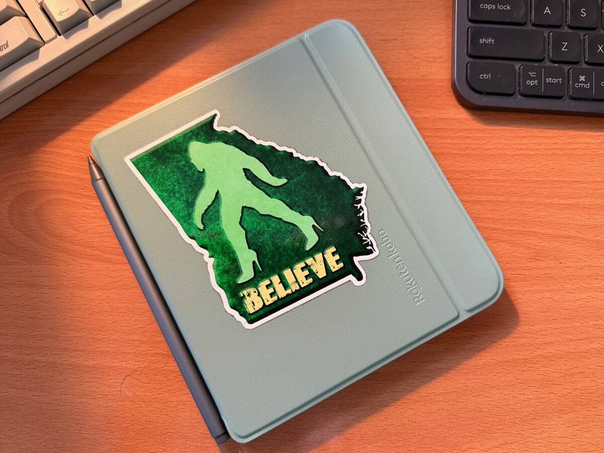
Covers: I bought Kobo’s standard sleep cover for mine.2Pictured at the top of this post, with the rad sticker I got at a Sasquatch-themed rest stop in south Georgia. It feels like a clear improvement over Amazon’s standard cover for the Oasis. It’s better “vegan leather” material on the outside with a soft microfiber-like material inside the cover. It’s got magnets that sleep/wake the Kobo when you close or open the cover. And it’s much easier and nicer to hold when it folds back, without feeling like it’s adding too much bulk to the device. Even though I felt comfortable using the Libra Colour without a cover, I’m comfortable leaving this one all the time. With the Kindle, I was looking for any opportunity to take the Oasis out of its cover.
Sleep and Wake: Incidentally, the Libra Colour seems to sleep and wake a lot faster than the Kindle Oasis does.
Progress Display: One of the few visible differences while actually reading a book is how they display progress. Kindle by default gives a percentage of progress through the entire book, and an estimate of how many minutes it’ll take to finish the current chapter. Kobo shows the chapter number along with a page count for the chapter at the top, with a page count for the entire book at the bottom. There’s also a thin line showing progress through the entire book at the bottom of the screen.
Personally, I prefer Kobo’s method by a lot. Kindle’s time estimates weren’t always accurate, and obviously they can’t account for the time I spend looking up stuff, or reading and re-reading the same paragraph over and over again until my brain gets back on track, or just plain sitting there and thinking of some unrelated nonsense. It’s a lot easier for me to see “page 1 of 45” and decide whether I want to tackle the next chapter or call it a night.
Tips for the Kobo
Bookerly: As commenter Lee Hauser mentioned on my last post, you can download Amazon’s e-reader fonts (including my favorite, Bookerly) for free, and simply copy them into a “fonts” folder on your Kobo. Just this one tip has improved my experience with the device 1000%, and it’s made it feel like nothing but an upgrade over the Kindle Oasis.
Bookmarks: You can tap the upper-right corner of any Kobo e-reader to get a “folded corner” icon, which quickly adds that page to the list of Annotations for the book. You can access the Annotations by tapping in the center of the screen, then choosing the icon in the bottom right depicting a page with a folded corner.
Changing the Brightness: While reading a book, you can quickly raise or lower the brightness of the backlight by swiping up or down along the left side of the screen. I mentioned this in the last post, but it’s such an ingenious design feature it deserves another call-out.
Most Recent Books: Also while reading a book, if you swipe down from the top of the screen, it’ll show a panel with your three most recently-read books or documents (like PDFs, Pocket posts, Notebooks). This can be useful if you’re going back and forth between two books, between a book and your notes, etc.
OverDrive and Libby: You can check out books from the library using the built-in OverDrive integration, accessible from the Discover tab, and it works well. But I’ve checked out books within the Libby app on my iPhone and been surprised that they didn’t appear anywhere within the Libra Colour’s interface, even in the OverDrive section (which gives a list of your current holds, but not the books you’ve currently got loaned out).
I eventually figured out that I need to start reading them within the Libby app — choose the “Read With…” option, and then Libby instead of Kindle. Once I’d done that, it automatically showed up in the My Books tab on the Kobo after I’d synced. Somewhat obvious in retrospect, but that extra step had never occurred to me, since I’d had no intention of actually reading them in the Libby app.
PDFs as Notebooks and Planners: Based on screenshots I’d seen of the Kobo Libra Colour, I’d thought that the notebook section would have tons of sample templates to use. So I was surprised to see that the built-in options are limited to just a blank page or horizontal rule lines.
As it turns out, these aren’t separate notebook templates on the My Notebooks page. Instead, people are saving templates as PDFs and copying them onto the Kobo, where they show up in the My Books list. Then, they can take advantage of the draw-anywhere annotation to use them as notebooks. Another thing that seems obvious in retrospect but hadn’t occurred to me.3It does seem a little gross, in my opinion, that the easiest ones to find are being sold on etsy instead of shared freely.
Notebooks and the Pen
In my last post about the Libra Colour, I said that a stylus was unnecessary and that I had no intentions of buying one. As somebody who still hates annotating books4And quickly deleted my demo highlights and note for Salem’s Lot the second after the above photo was taken, I still think that it’s unnecessary for me. But I bought one anyway.
I bought the Metapen M2, as what I hope is my last Amazon purchase. That pen is less than half the cost of Kobo’s “official” stylus5Which seems horribly overpriced to me, but is somehow significantly less than what Microsoft is charging for the Surface stylus, so maybe I’m just bad at business, which puts it in or at least close to “impulse purchase” territory. And since the company seems to prefer you buy their products from Amazon, I figured I should get one now in case I ever need it in the future.
I still don’t intend to use the notebooks on this device, either, since the iPad seems much better suited to handwritten notes, at least how I would tend to use them. But if I’ve got a pen anyway, I like the idea of having scratch paper always available as long as I’ve got a book with me.
The Libra Colour gives two options for notebooks: a “basic notebook” that’s just a series of blank pages on which you can draw anywhere, or an “advanced notebook” designed more for converting handwriting to text.
The basic notebook seems to work as well as it possibly can with an e-Ink device, and it gives options for colors, line weights, and several different pen types. But it doesn’t feel as immediately responsive to me as using an Apple Pencil with the iPad, so I can’t imagine being comfortable with it for anything other than handwriting.
The advanced notebook has uncannily good handwriting recognition. Like, I think I’ve had even more success here than with any app on the iPad, since the Libra Colour has never once gotten a word wrong.6But to be fair, I’ve written a lot more on the iPad, and for a lot longer. It’s also okay at recognizing stuff like ordered lists with indentation. There are additional options for adding diagrams or inserting freeform drawing blocks amidst the text, and it has gesture recognition and basic shape recognition (so it’ll clean and straighten up lines, circles, boxes, etc if you hold down the pen after you’ve drawn it).
As soon as you try to move things around on the page, though, you’re immediately reminded of the limitations of an e-Ink display. I’m aware that there are people who swear by e-Ink tablets like the Remarkable, but I always find the refresh rate and responsiveness too frustrating. To me, the Libra Colour’s notebooking features feel like putting a ton of work into something that’s doomed to be unsatisfying.


Recommendations (as of March 2025)
The only e-readers I’ve ever used personally are the Kobo Libra Colour, a Kindle Oasis, a Kindle Paperwhite, and very briefly a friend’s Boox Palma. But based on that plus what I’ve seen in reviews, and what I know of overall screen technology and the like, I know what I’d recommend.
My preference: The Kobo Libra Colour, which is a straightforward, well-designed e-reader that does just about everything right, includes buttons for turning pages, has lots of options for adding content, and has color as a fun novelty
I Just Want the Color But Don’t Need the Buttons: The Kobo Clara Colour is smaller but much cheaper
I Want Color and Buttons and I Still Want to Use the Kindle Store: The Boox Go Color 7 has been getting pretty good reviews, and it can use the Kindle app, the Kobo app, and plenty of others. I wouldn’t choose it for myself because I don’t like Android OS.
I Don’t Want Color But I Do Want the Buttons: It looks like the Kobo Sage is the only option from a major brand, now that the Libra 2 has been discontinued? It seems analogous to the Libra line, but without color and an 8″ screen instead of 7″. It’s also more expensive than I’d spend on an e-reader, personally.
I Agree That’s Too Much to Pay But I Still Want a Monochrome E-Reader With Buttons: I’d recommend looking for a used Kobo Libra 2. It’s been discontinued, but it’s the same form factor as the Libra Colour, without color and without support for the stylus. Otherwise, I’d recommend looking for a used Kindle Oasis, which has also been discontinued. I don’t intend to sell mine, but I’ve had it for years and it’s still in near-perfect shape.
I Just Want it To Be The Size of a Smartphone: The Boox Palma and Palma 2 are designed specifically for you, especially if you’re a masochist who likes Android OS.
I Just Want an E-Reader And I Don’t Share Your Hate for Amazon: Get a Kindle Paperwhite. It’s a really, really well-designed e-reader. It’s not that expensive considering how long they last and how much use you’re likely to get out of it. I’d recommend paying extra to remove the ads — even though the whole idea of that is gross — because it’s a matter of paying $20 or so now to head off years of annoyance. Also, I wouldn’t recommend getting the base-line Kindle, even though it’s significantly cheaper; the Paperwhite line is better enough to justify the expense.
Um, You Failed to Mention Any of These Larger Devices That are Specifically Designed to Function as Notebooks: My main use case for an e-Ink device is “one-handed reading while lying in bed,” and I’m happier using an iPad for drawing and taking notes, so the notebook-sized devices don’t have anything that appeals to me. Your mileage may vary.
You Also Failed to Mention Any of the Primarily Chinese-made Smartphone-sized E-Ink Devices That Actually Function as Smartphones: Even as someone who’s in the middle of a social media hiatus and loving it, I don’t see the appeal of an e-Ink smartphone at all. Just the lack of a way to play videos on my phone is a non-starter on its own. Your mileage may vary (but I think it’s weird).